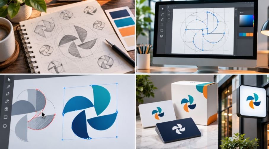
A great logo can make your business memorable, but creating one requires more than attractive colors and stylish fonts. Learning how to create a professional logo in Illustrator helps you build an original, scalable design that looks sharp on everything from business cards to massive billboards.
When I design logos, I focus on simplicity, balance, and brand identity before touching any design tools. Adobe Illustrator makes the process easier with vector graphics, precise drawing tools, and flexible customization options.
In this guide, I’ll walk you through the complete logo design process, including document setup, geometric construction, typography, color selection, and professional file exports.
Why Is Adobe Illustrator Best for Professional Logo Design?
Adobe Illustrator is a popular choice for professional logo design because it uses vector graphics rather than resolution-dependent pixels.
Unlike raster images, vector logos can scale from tiny website favicons to large outdoor signs without losing sharpness.
Illustrator also provides advanced tools for geometric alignment, typography customization, and precise editing. Whether you’re creating branding for an American startup, local restaurant, or established company, these features help maintain visual consistency.
I especially recommend Illustrator because it allows designers to create reusable logo variations for both digital and print applications.
Although Illustrator offers greater control over vector construction and customization, comparing it with other design platforms can help you choose the right workflow. This Adobe Illustrator vs Canva for logo design comparison explains the differences in features, flexibility, and design capabilities.
What Should You Do Before Creating a Logo in Illustrator?
Before opening Illustrator, I always research the brand’s personality, competitors, target customers, and industry.
A technology company might need a clean geometric symbol, while a neighborhood coffee shop could benefit from a warmer, more approachable design.
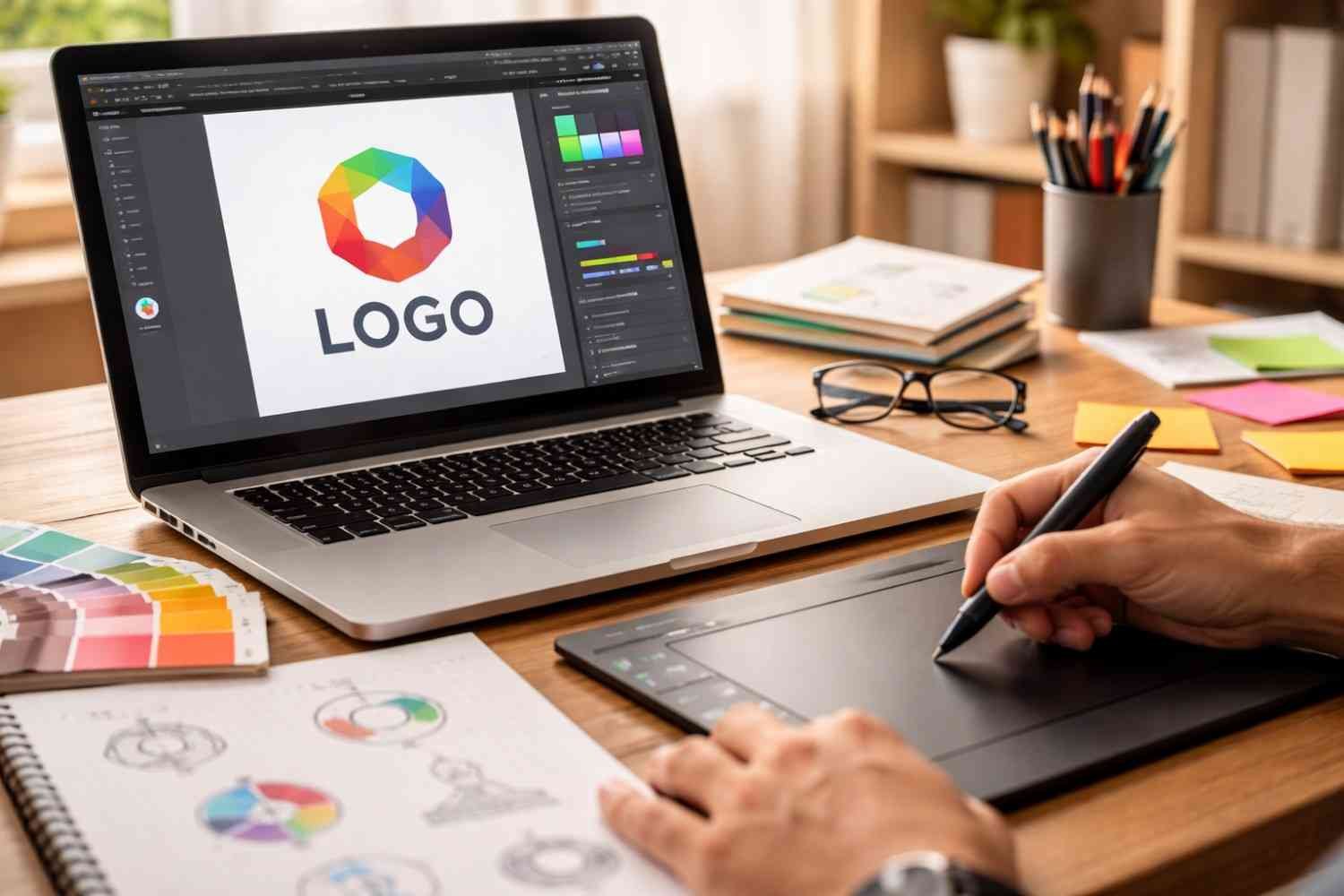
I sketch several concepts using basic shapes, letter combinations, and negative space. This helps me identify memorable ideas before spending time constructing digital artwork.
The strongest professional logos communicate a clear identity without unnecessary visual complexity.
How to Create a Professional Logo in Illustrator Step by Step
Understanding how to create a professional logo in Illustrator becomes easier when you follow a structured workflow instead of experimenting randomly with tools.
Step 1: Set Up Your Illustrator Document
Open Illustrator and select File > New.
I recommend starting with a square artboard, such as 2048 × 2048 pixels, to provide enough working space. The exact dimensions aren’t critical because vector artwork remains resolution-independent.
Choose RGB Color Mode for digital projects and configure Raster Effects to High (300 ppi) when your design includes raster effects requiring high-resolution output.
Enable Smart Guides through the View menu to improve alignment. If you need fixed grid snapping, use Snap to Grid instead, since it prevents Smart Guides from operating simultaneously.
Step 2: Build a Geometric Logo Grid
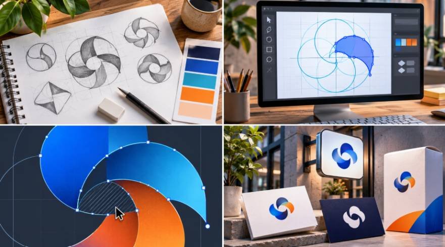
Professional logo design often begins with simple geometric construction.
I use the Ellipse Tool (L) and Rectangle Tool (M) to create circles, squares, and other foundational shapes.
Holding Shift while dragging maintains consistent proportions. Adding Alt on Windows or Option on Mac draws the shape outward from its center.
To duplicate an element precisely, use Ctrl/Cmd + C followed by Ctrl/Cmd + F to paste it directly in front. You can then scale the duplicate to create nested shapes.
Group the construction elements using Ctrl/Cmd + G, reduce their opacity to approximately 20–30%, and lock the reference layer.
This creates a helpful vector blueprint without interfering with the final artwork.
Step 3: Create Custom Shapes With the Shape Builder Tool
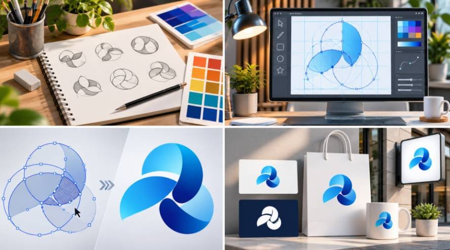
The Shape Builder Tool simplifies complex vector logo construction.
First, select overlapping geometric shapes. Activate Shape Builder using Shift + M.
Drag across adjacent regions to merge them into a single custom shape. Hold Alt on Windows or Option on Mac while clicking or dragging to remove unwanted regions.
I also use the Pathfinder panel when I need precise shape unions, intersections, or subtractions.
For a more detailed walkthrough of the complete logo creation process, explore this guide on how to make a logo in Illustrator, including practical techniques for building and refining custom logo designs.
These techniques help create recognizable symbols without drawing every curve manually.
Step 4: Refine Vector Paths and Curves
Once the basic symbol is ready, I refine its proportions and outlines.
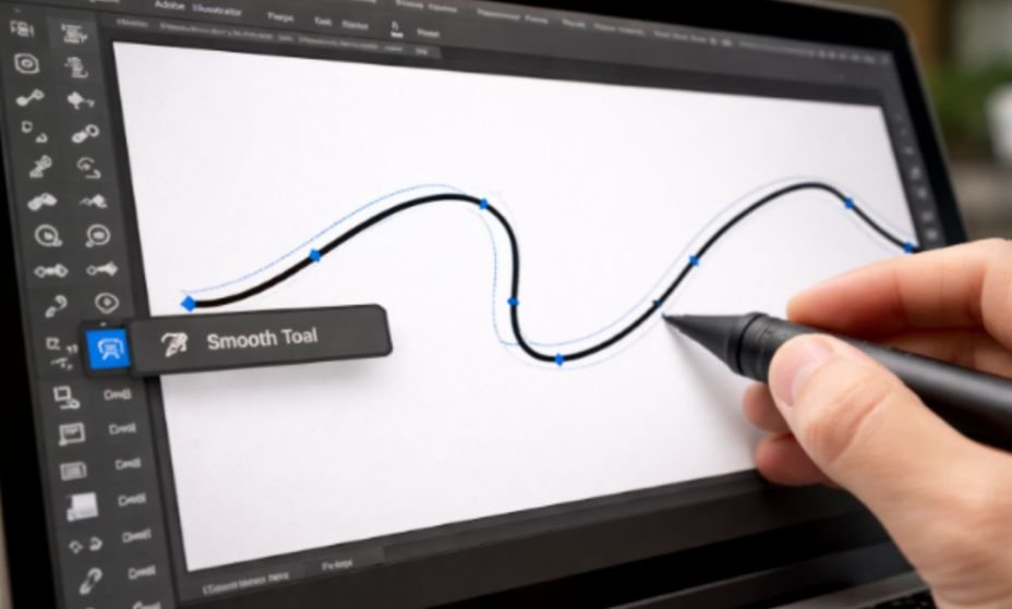
The Direct Selection Tool (A) allows me to reposition individual anchor points and adjust curves. Where supported, Live Corner widgets let me create smoother, rounded corners.
For hand-drawn concepts, I import sketches using File > Place and trace them with the Pen Tool (P).
When working with imported sketches or raster references, Illustrator’s Image Trace feature offers another way to convert bitmap artwork into editable vector shapes. Learn how to use Image Trace in Illustrator to create vector artwork that you can refine for your logo designs.
I keep anchor points to a minimum because excessive points often create uneven curves.
Consistent alignment, balanced negative space, and smooth paths make even minimalist logos appear more polished.
Step 5: Customize Typography for Your Logo
Typography strongly influences how customers perceive a business.
I choose fonts that reflect the brand’s personality. Sans-serif fonts often suit modern technology companies, while serif styles can work well for traditional professional services.
Using the Type Tool (T), I add the business name and adjust letter spacing, kerning, and alignment.
For custom lettering, I duplicate the text and choose Type > Create Outlines, or use Ctrl/Cmd + Shift + O.
The outlined copy becomes editable vector artwork. I can modify letter stems, ascenders, and individual shapes using Direct Selection.
However, I always preserve an editable text copy and verify commercial font licensing before delivery.
Step 6: Choose Colors and Test Logo Variations
I prefer finalizing the logo in black and white before introducing color.
A recognizable monochrome logo generally performs better across different backgrounds and printing conditions.
Next, I use the Swatches panel to apply a consistent brand color palette.
The Gradient Tool (G) can introduce subtle linear or radial gradients when the brand’s visual identity calls for additional depth. However, I avoid unnecessary effects that reduce clarity.
For print preparation, I preview potential color changes through View > Proof Setup > Working CMYK, then confirm final colors with the printer’s specifications.
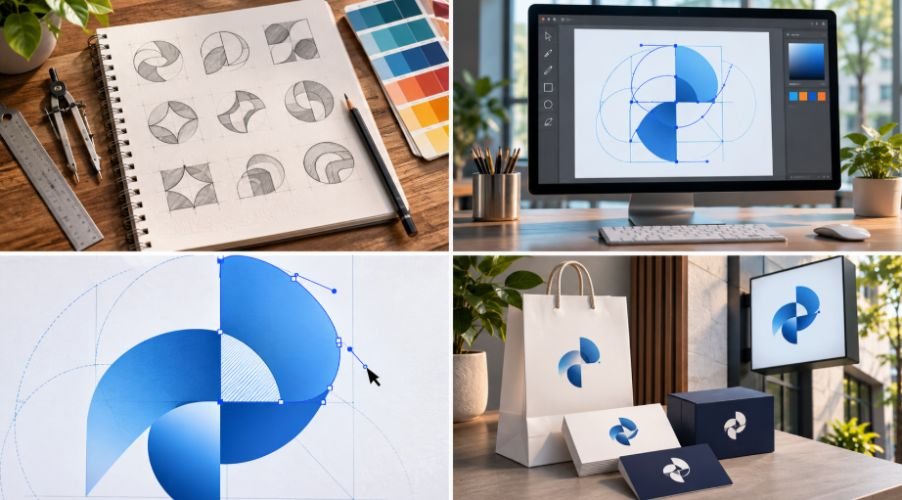
I also test the logo on social media profiles, business cards, packaging, and signage to ensure it remains readable at different sizes.
Step 7: Export Your Professional Logo Files
Once the design is complete, I create horizontal, stacked, and icon-only variations.
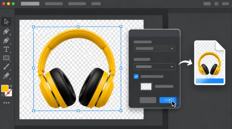
I group each version separately and open Window > Asset Export. Then I drag the grouped artwork into the panel and choose the required output formats.
SVG preserves scalable vector graphics for websites and responsive interfaces. EPS supports compatible professional printing and signage workflows. Transparent PNG works well for presentations, digital advertisements, and social media.
JPEG is useful for flattened previews, although it doesn’t support transparent backgrounds and shouldn’t replace a vector print master.
I also preserve the original AI document and prepare a print-ready PDF when required.
Adobe’s Asset Export documentation explains how to export multiple logo assets efficiently.
What Common Mistakes Should You Avoid in Illustrator Logo Design?
One mistake I frequently notice is adding too many decorative elements.
Complicated symbols, excessive colors, uneven curves, and poorly spaced lettering can make logos difficult to recognize.
Another problem is relying on temporary design trends instead of developing a distinctive brand identity.
I also avoid using low-resolution images as final logo artwork.
For commercial branding, originality matters. Businesses can review potential trademark conflicts through the United States Patent and Trademark Office before committing to a design.
How Can You Make Your Illustrator Logo Look More Professional?
I always evaluate a logo based on simplicity, readability, scalability, and visual balance.
Using consistent spacing, intentional negative space, and customized typography often improves the finished design more than additional effects.
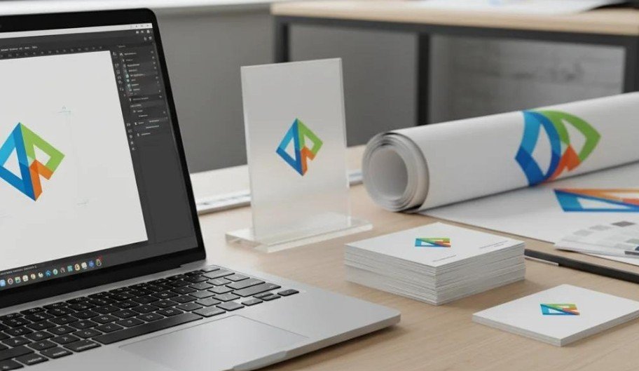
I also preview logos on realistic brand mockups to identify problems that aren’t obvious on an Illustrator artboard.
A successful logo should remain recognizable whether it appears on a mobile screen, printed merchandise, or a storefront.
Frequently Asked Questions
1. Can Beginners Design Professional Logos in Illustrator?
Yes. Beginners can create professional-looking logos by mastering basic drawing tools, geometric shapes, typography, and alignment techniques.
2. What Size Should a Logo Be in Illustrator?
A 1000 × 1000 or 2048 × 2048-pixel artboard provides convenient working space. However, vector logos can scale without losing quality regardless of the initial artboard dimensions.
3. Is Illustrator Better Than Photoshop for Logo Design?
Illustrator is generally better for scalable vector logo design, while Photoshop specializes in raster image editing and photographic effects.
4. What Is the Best Way to Learn How to Create a Professional Logo in Illustrator?
Start with simple geometric logos, practice the Pen and Shape Builder tools, refine typography, and learn proper vector export techniques. Working on original branding projects helps develop both creative and technical skills.
Final Thoughts
Creating a professional logo requires thoughtful planning, precise vector construction, and consistent branding decisions.
I believe the best approach is to start with a clear concept, build clean geometric shapes, customize typography carefully, and test the design across different applications.
With Adobe Illustrator’s powerful drawing and exporting tools, you can develop distinctive brand identities that remain sharp, recognizable, and adaptable across digital and printed materials.