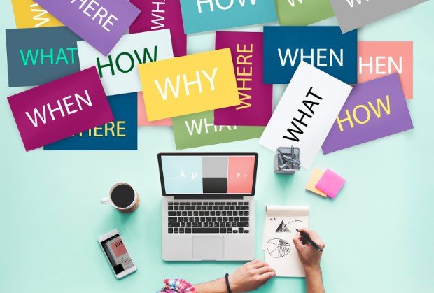
When I first started studying design, I assumed typography was just about picking attractive fonts. Over time, I realized it plays a much bigger role. Typography determines how easily people read content, how they interpret a message, and whether a design feels professional or confusing.
By understanding why is typography important in graphic design helps designers create visuals that communicate clearly instead of simply looking decorative.
Typography influences how viewers move through a design, what information they notice first, and how they emotionally respond to the content. Without strong typography, even a beautiful layout can fail to communicate effectively.
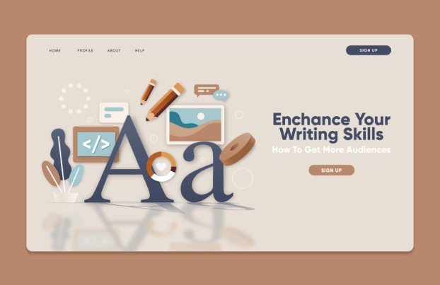
What Typography Means in Graphic Design
Typography is the art and technique of arranging text so that it is readable, balanced, and visually appealing. It involves choosing fonts, adjusting spacing, managing line length, and organizing text in a structured way.
Good typography helps readers understand information quickly. Poor typography forces readers to work harder and often causes them to stop reading entirely. Designers use typography to structure information, guide the reader’s eye, and support the overall message of a design.
Why did Typography Became Important in Graphic Design
Typography plays a central role in communication. A design may contain images, colors, and shapes, but typography carries the actual message. Well-structured typography helps viewers understand what is most important. Headlines attract attention, subheadings organize ideas, and body text delivers the details. This hierarchy allows readers to scan information efficiently and absorb the content faster.
Typography also improves readability. The right font size, spacing, and contrast ensure that text is comfortable to read across different formats such as websites, posters, packaging, or presentations. When typography is used effectively, people can understand a message in seconds rather than struggling to decode it.
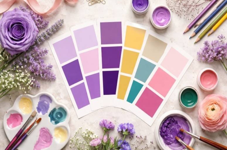
Typography Builds Brand Identity
Typography is a major part of brand recognition. Many brands become recognizable largely because of their typography style. A bold, geometric font can feel modern and innovative. A serif font may communicate tradition, credibility, or professionalism. Script fonts often feel elegant or personal.
By consistently using the same typography across marketing materials, websites, and social media, brands build familiarity and trust with their audience. Typography therefore becomes a visual signature that people associate with a specific company or message.
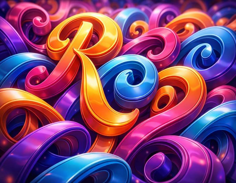
Typography Shapes Tone and Emotion
Typography also influences how people emotionally interpret a design. The same sentence can feel completely different depending on the typeface used. For example, a clean sans-serif typeface can make a message feel modern and minimal. A handwritten style font may feel friendly or casual.
A heavy bold font might communicate strength or urgency. Designers use typography intentionally to match the tone of the content. This emotional layer strengthens the message and makes the design more memorable.
Typography Improves Accessibility
Good typography also improves comprehension for people reading quickly on mobile devices or smaller screens. Design that prioritizes accessibility ultimately benefits every reader because it removes unnecessary friction from the experience.
Common Typography Mistakes Designers Make
In my experience, many beginners struggle with typography because they try to do too much at once. Using too many fonts is one of the most common mistakes. Mixing several unrelated typefaces can make a design feel chaotic and unprofessional. Another mistake is not attracting the attention of readers for long paragraphs.
While these fonts may look interesting in titles, they often reduce readability when used for body text. Poor spacing between lines and letters is another frequent issue. Text that is too tight or too spread out can quickly become uncomfortable to read. Keeping typography simple and structured usually produces stronger results.
Simple Typography Tips That Instantly Improve Design
Over time I have found a few practical rules that consistently improve typography.
- Use one or two font families to maintain visual consistency.
- Create clear hierarchy by making headings noticeably larger than body text.
- Maintain consistent spacing between paragraphs and sections.
- Choose fonts that remain readable across different screen sizes.
- Align text consistently so that the layout feels organized and structured.
- Small improvements in these areas often make a design look far more professional.
Where Typography Has the Biggest Impact
Typography appears in almost every form of visual communication. It shapes how people interact with websites, advertisements, posters, mobile apps, presentations, and social media graphics.
It is also essential in branding materials such as logos, packaging, and marketing campaigns. In each case, typography guides attention and reinforces the message behind the design. Even simple layouts can feel polished and effective when typography is handled carefully.
Frequently Asked Questions
1. Why is typography important for designers?
Typography helps designers communicate messages clearly and guide the reader’s attention through visual hierarchy.
2. How does typography affect readability?
Font choice, spacing, line length, and contrast all influence how easily people can read and understand text.
3. How many fonts should a design use?
Most professional designs use one or two font families with different weights to create hierarchy without clutter.
4. Can typography influence brand perception?
Yes. Typography strongly influences how people perceive a brand’s personality, professionalism, and credibility.
Final Takeaways
Over the years I have learned that typography is one of the most powerful tools in design. It controls readability, shapes brand identity, and determines how people emotionally respond to visual content. When I came to know why is typography important in graphic design, I began paying much closer attention to font choices, spacing, and hierarchy in every project.
Strong typography does more than make a design look good. It makes the message clear, memorable, and easy for people to understand.