Yellow has always fascinated me because it instantly catches the eye. It appears in everyday life—on warning signs, bright designs, flowers, and sunlight—and it never seems to fade into the background. The color feels energetic, warm, and impossible to ignore.
Because of that, understanding what makes yellow becomes more interesting than it first appears. This color is not only about aesthetics. Science, human vision, color theory, and psychology all contribute to why yellow exists and why it stands out so strongly compared with other colors.
Where Does Yellow Come From? The Color Secret Few Notice
Yellow exists within the visible electromagnetic spectrum of light, the range of wavelengths that human eyes can detect. It appears at approximately 570–580 nanometers.
Colors in this part of the spectrum reflect light efficiently, which makes yellow appear bright and vivid. Because of this strong reflection, yellow objects are often easier to notice even when lighting conditions change.
Yellow in Light vs Yellow in Paint

Understanding what makes yellow requires recognizing that color behaves differently in digital displays and physical pigments. Screens, televisions, and digital graphics use the RGB color system. In this system, yellow appears when red and green light combine together.
Paint, ink, and printing materials follow a subtractive color model. In this system, yellow is treated as a primary color. Artists and printers typically begin with yellow pigment rather than trying to mix it from other colors. This difference explains why digital designers can create yellow through light combinations while painters usually start with yellow paint itself.
Why Yellow Grabs Attention So Quickly
Yellow is widely recognized as one of the most visible colors to the human eye. Its brightness allows it to stand out strongly against darker backgrounds. Because of this, yellow is frequently used in safety design and caution markings. In digital systems, the same effect is created using RGB color model, where yellow appears when red and green light combine to produce a bright, highly visible tone.
Road warnings, hazard signs, and safety labels often rely on yellow backgrounds so people notice them immediately. Pairing yellow with black creates even stronger contrast. This combination appears commonly in warning symbols, hazard stripes, and safety signals because it draws attention quickly.
The Psychology of Yellow

Yellow also influences emotions and perception. Many people associate yellow with warmth, optimism, creativity, and energy. The color often reminds people of sunlight, bright days, and positivity. Because of these emotional associations, yellow is frequently used in branding and marketing to create an energetic or cheerful feeling.
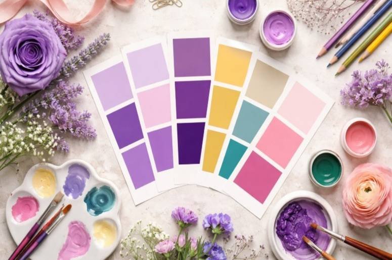
Interestingly, color relationships play a major role in how we perceive combinations in art and design. While yellow creates brightness and attention, designers often balance it with deeper tones or complementary shades. For example, exploring colors go well with purple can help artists and decorators create visually balanced palettes that feel both vibrant and harmonious.
However, yellow can also communicate caution or urgency when used in safety situations. This dual meaning makes yellow one of the most powerful colors in visual communication.
How Designers Use Yellow
Designers typically use yellow as an accent color rather than a dominant background. Its brightness works best when it highlights something important. For example, yellow often appears in call-to-action buttons, sale banners, or key information sections because it naturally directs the viewer’s attention.
Pairing yellow with darker tones such as black, gray, navy, or white creates strong contrast while keeping the design balanced.
Yellow in Nature

Yellow appears frequently throughout nature. Sunflowers, lemons, bananas, corn, and autumn leaves all display natural yellow tones. Because people encounter yellow regularly in the natural world, the color often feels warm and familiar. This natural connection reinforces the emotional associations of energy and brightness.
The Simple Explanation
The question of what makes yellow has more than one answer. Scientifically, yellow appears when specific wavelengths of light reach the eye. In digital displays, yellow forms when red and green light combine.
In painting and printing, yellow functions as a primary pigment used to create other shades. At the same time, yellow stands out because human vision detects it quickly and because it has long been associated with brightness, warmth, and caution.
Frequently Asked Questions
1. Is yellow a primary color?
Yes. In traditional painting and printing systems, yellow is considered a primary color used to mix other shades.
2. What colors create yellow on screens?
Digital displays produce yellow by combining red and green light in the RGB color model.
3. Why is yellow used for warning signs?
Yellow attracts attention quickly and remains visible in many lighting conditions, making it ideal for caution and safety signs.
4. Does yellow always represent happiness?
Not always. Yellow often represents energy and positivity, but it can also signal caution or urgency depending on the context.
Final Thoughts
The more I explore color, the more fascinating yellow becomes. It is not just a bright shade; it is the result of how light behaves, how the human eye processes color, and how people interpret visual signals.
By knowing what makes yellow reveals how science and perception work together. That combination is exactly why yellow continues to play such an important role in design, communication, and everyday visual experiences.