Designing a logo in Illustrator is one of those skills that looks simple from the outside. You see a clean icon, balanced typography, maybe two colors, and it feels effortless. But when you actually try to create one, the process quickly becomes more complex. Shapes don’t align the way you expect, typography feels slightly off, and the design rarely looks as polished as professional brand marks.
Over time, designers learn that making a strong logo is less about drawing and more about thinking. The real work happens before the software even opens, researching the brand, sketching concepts, and understanding how the logo will function across packaging, websites, signage, and digital platforms. Once that thinking is clear, Illustrator simply becomes the tool that transforms ideas into precise vector graphics.
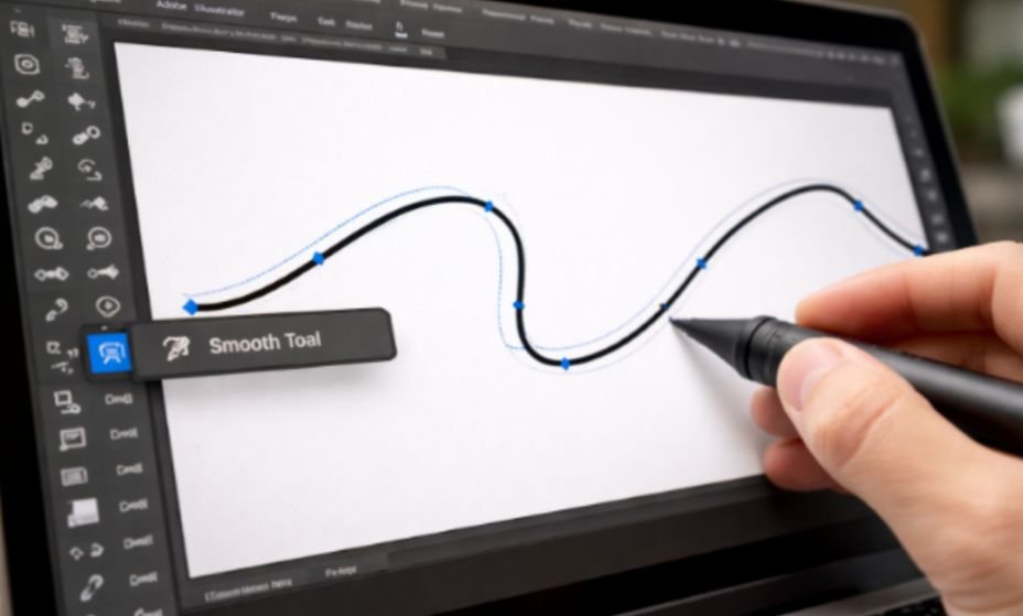
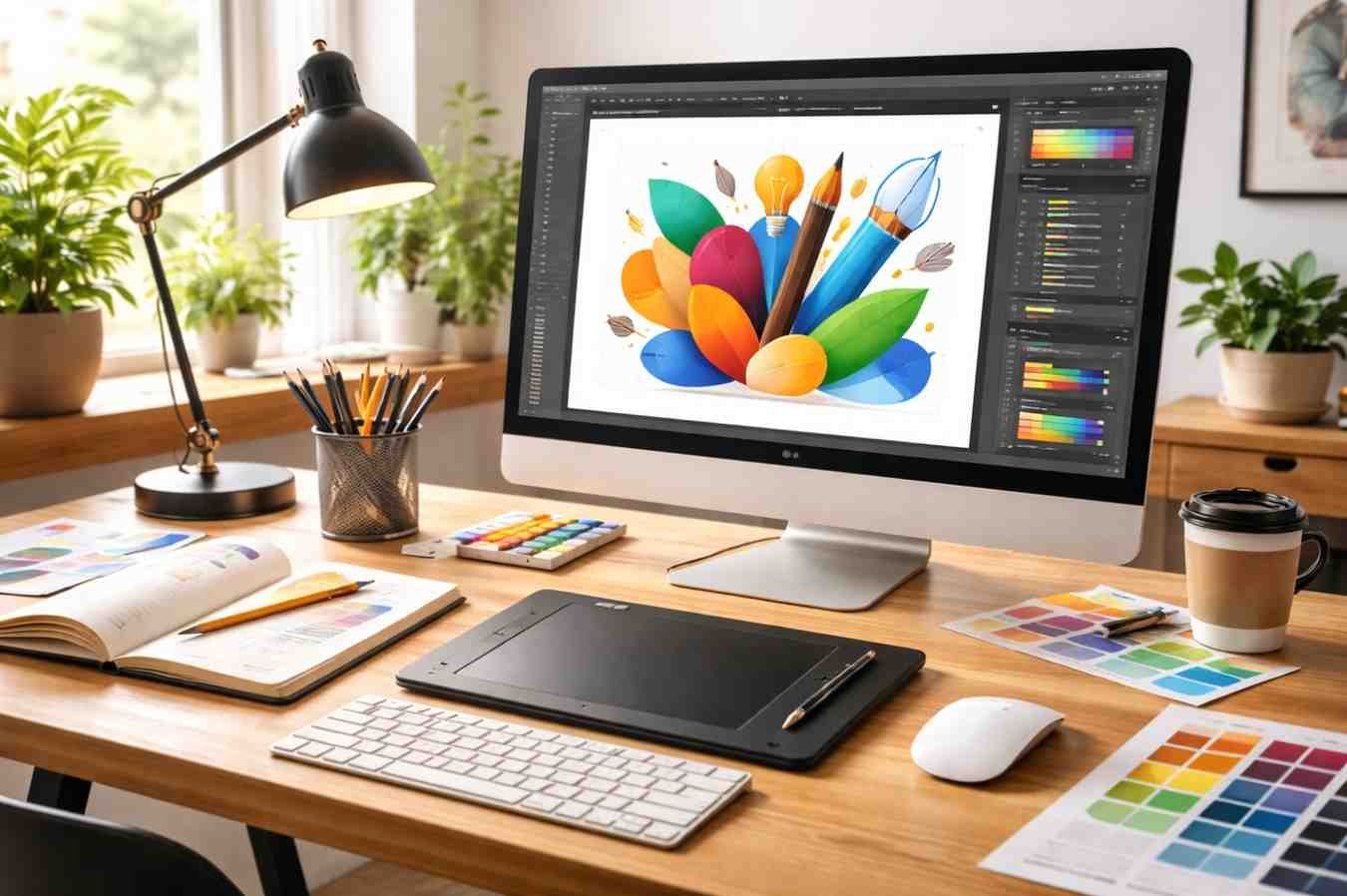
Why Professional Designers Use Illustrator For Logo Design
![]()
Professional designers rely on Illustrator because it works with vector graphics rather than pixels. Vector artwork is built using mathematical paths, which means the logo can scale infinitely without losing quality. The same logo file can appear on a tiny social media icon or a massive outdoor banner and still remain perfectly sharp.
This flexibility is essential for branding. A logo is rarely used in just one place. It appears on websites, product packaging, apps, presentations, storefront signage, and merchandise. If the design isn’t created as a vector, resizing becomes a problem very quickly.
Illustrator also offers tools specifically suited for logo creation. Precision alignment, path editing, grid systems, and advanced shape construction allow designers to create clean, balanced graphics. Instead of drawing freely like in illustration software, logo design focuses on controlled geometry and careful adjustments.
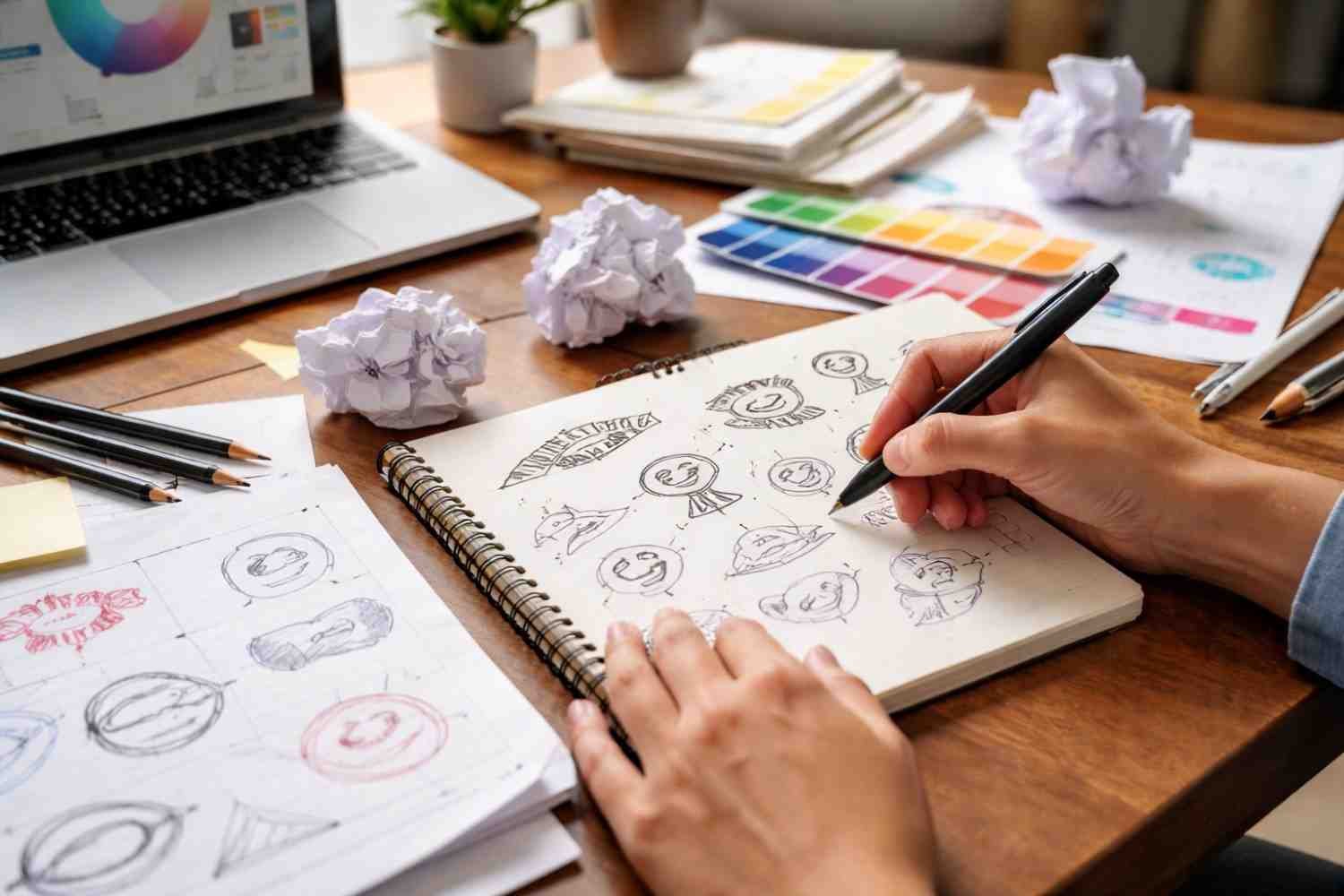
The First Step Designers Take Before Opening Illustrator
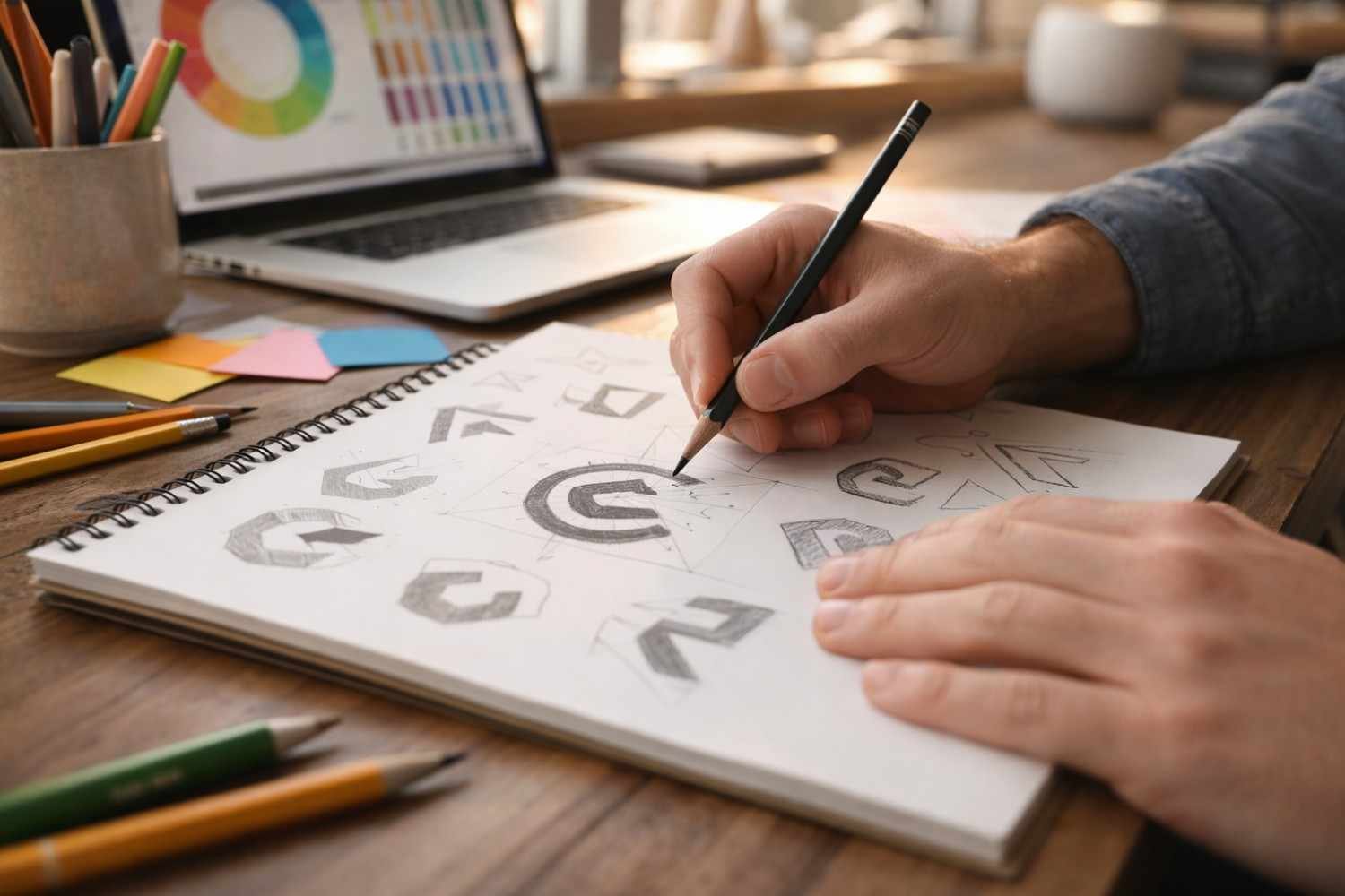
One of the biggest differences between beginners and professionals is how much thinking happens before designing.
Experienced designers rarely jump straight into the software. Instead, they spend time understanding the brand and sketching multiple ideas. Sketching allows ideas to develop quickly without worrying about technical constraints.
Here is the preparation process most designers follow:
- Research the brand’s mission, audience, and industry positioning
- Study competitor logos to identify common patterns and avoid similarities
- Sketch multiple rough concepts using pencil and paper
- Select the strongest concept before moving into Illustrator
Sketching might seem old-fashioned, but it accelerates the creative process. You can explore ten ideas on paper in the time it takes to construct one in software.
Once a direction feels promising, Illustrator becomes the place where the concept is refined with precision.
Setting Up Your Illustrator Workspace
When starting a logo file, designers usually create a simple workspace that helps maintain alignment and structure.
A common canvas size is 1920 × 1080 pixels, which provides enough space to experiment with variations. Color mode depends on the project. RGB is typically used for digital platforms, while CMYK works better for printed materials.
Smart Guides and grids should also be enabled. These features make it easier to align objects, maintain symmetry, and keep shapes consistent. Good alignment is one of the details that separates amateur work from professional results.
Organizing layers early also helps keep the design file clean, especially if multiple logo variations are created later.
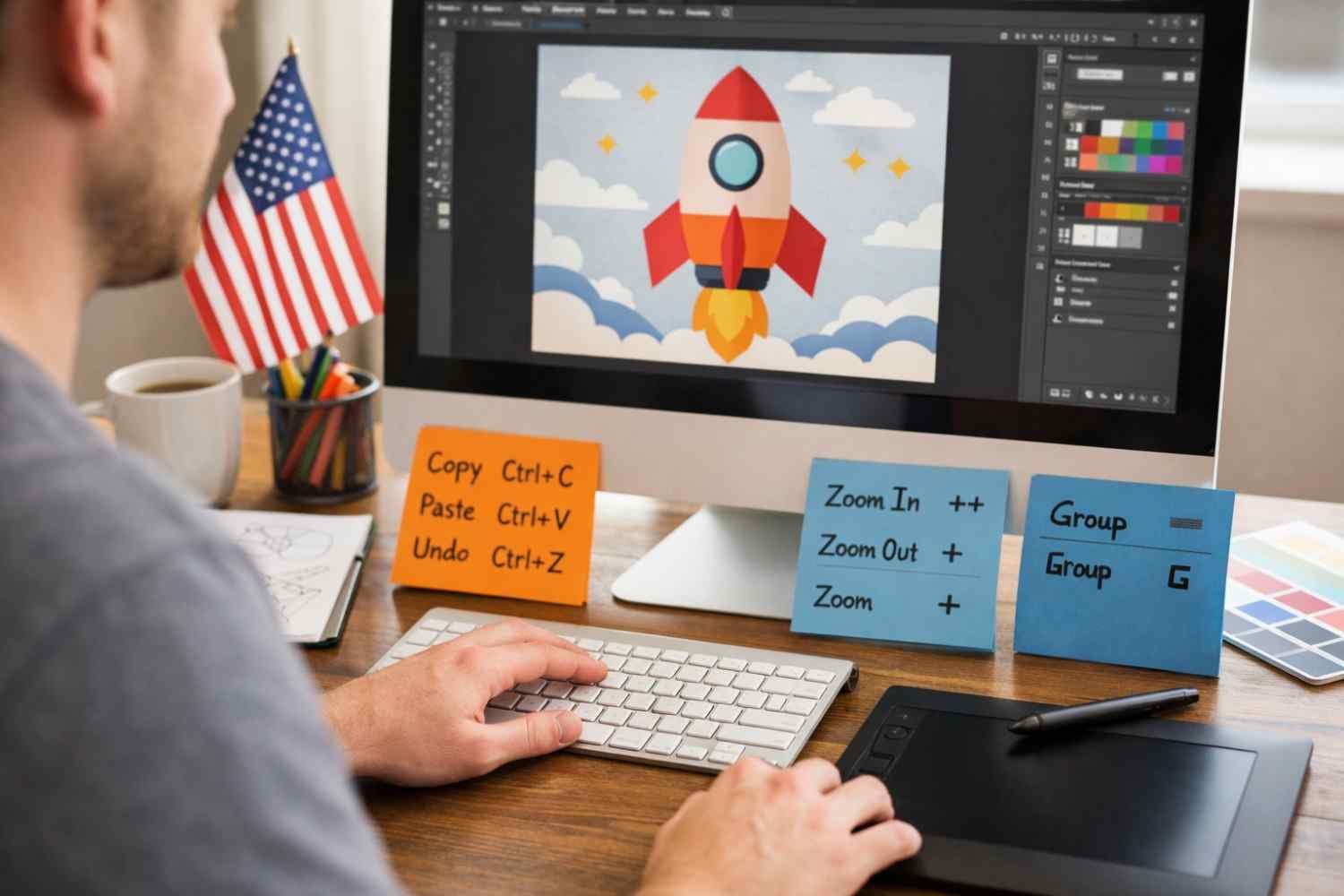
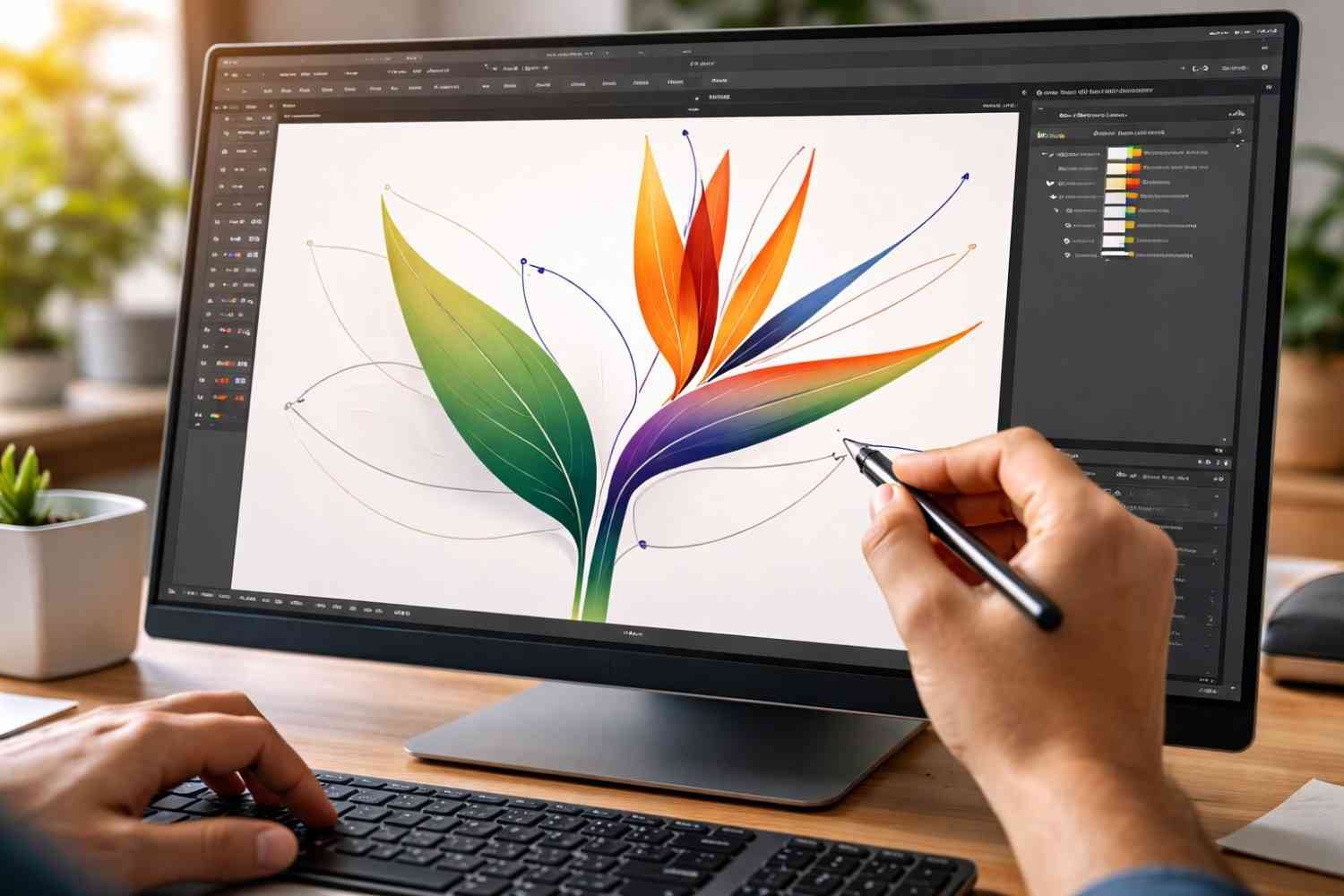
How To Make a Logo In Illustrator Step By Step
![]()
Once the concept is ready and the workspace is set up, the actual logo construction begins. Professional designers focus on building logos using simple geometric shapes rather than complex drawings.
1. Build the Base Using Shapes
Most logos begin with basic forms like circles, rectangles, and triangles. These shapes are combined and modified to create more complex icons.
Illustrator’s Shape Builder Tool is extremely useful here. It allows designers to merge overlapping shapes or remove unwanted sections quickly. This method keeps the geometry clean and consistent.
2. Use the Pen and Curvature Tools
The Pen Tool remains one of the most powerful tools for logo creation. It allows precise control over anchor points and straight lines.
For smoother curves and organic shapes, many designers switch to the Curvature Tool, which simplifies path creation while maintaining smooth transitions.
3. Combine Shapes with the Pathfinder Panel
The Pathfinder panel allows shapes to interact with each other in several ways:
- Unite shapes into a single object
- Remove overlapping sections
- Create intersections between elements
- Divide shapes for complex compositions
These operations are essential for creating icons that feel clean and intentional rather than randomly assembled.
Typography and Color Decisions
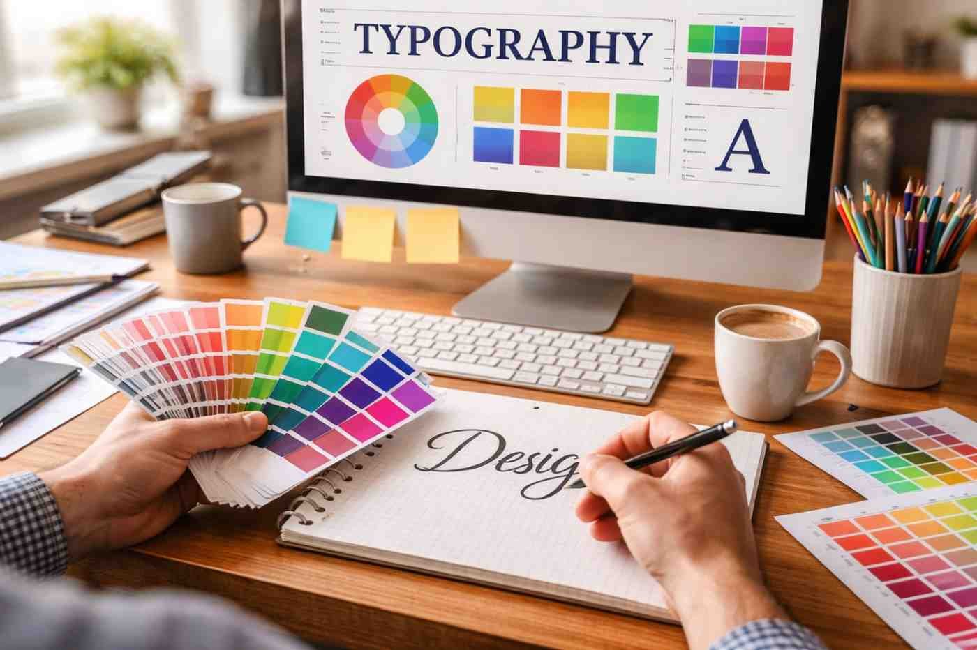
Typography often carries just as much meaning as the icon itself. A logo’s letterforms communicate personality, whether the brand feels modern, playful, authoritative, or minimal.
Designers usually begin by experimenting with a few typefaces that match the brand’s tone. But instead of leaving the font untouched, adjustments are often made manually.
Kerning, which controls the spacing between individual letters, is one of the most important refinements. Even small spacing changes can dramatically improve readability, code optimization, and balance.
Once the typography feels right, designers convert the text into editable shapes using the Create Outlines command. This step ensures the logo remains consistent across devices and prevents font compatibility issues.
Color selection typically comes later in the process. Many professionals intentionally design the logo in black and white first. If the logo works without color, it will remain recognizable in any context.
Common Mistakes Beginners Make When Designing Logos
Many beginners struggle with logo design, so there are Illustration shortcuts for them because they help focus on both decoration and structure. Professional logos are usually simple, balanced, and highly adaptable.
Some common mistakes include:
- Overcomplicating the design with too many shapes
- Using too many colors
- Ignoring alignment and spacing
- Relying entirely on default fonts
- Designing logos that only work at large sizes
Keeping the design simple and scalable is one of the most reliable ways to create something that lasts.
Frequently Asked Questions
1. How Long Does It Take To Learn How To Make Logo In Illustrator?
Most beginners become comfortable with the basic tools within a few weeks of practice. However, mastering professional logo design usually takes much longer because it involves design thinking, typography knowledge, and branding strategy.
2. Do Professional Designers Always Sketch Logos First?
Yes, sketching is still a common step in professional workflows. It allows designers to explore ideas quickly and focus on concepts before worrying about technical details.
3. What Illustrator Tool Is Most Important For Logo Design?
The Pen Tool is often considered the most important because it allows precise control over vector paths. Combined with the Shape Builder Tool and Pathfinder panel, it enables complex logo construction.
4. What File Formats Should A Logo Be Delivered In?
Professional logo packages usually include AI or EPS master files along with SVG, PDF, and PNG formats. These formats ensure the logo works across digital platforms, print materials, and scalable applications.
Final Thoughts
Learning how to make a logo in Illustrator like a professional designer is less about mastering every tool and more about understanding the design process behind the software. Strong logos begin with research, thoughtful sketching, and a clear concept before any vectors are created. Illustrator then becomes the precision tool that shapes those ideas into scalable graphics that work everywhere a brand appears.
With consistent practice, attention to detail, and a focus on simplicity, Illustrator becomes one of the most powerful tools for building logos that feel intentional, balanced, and timeless.