When I first started making art, color felt like the part that could either pull everything together or ruin a solid sketch in minutes. I would find myself second-guessing every shade, adding too many colors, and ending up with work that looked busy instead of intentional. Over time, I realized the best palettes are not random at all. They come from a simple process: mood, hierarchy, contrast, and restraint.
If you want your artwork to feel more cohesive, more professional, and easier to finish, this guide will help. Choose color palette for art becomes much easier once you understand the small decisions that guide strong color choices.
Key Takeaways
- Start with mood before choosing colors
- Pick one dominant color to anchor the piece
- Limit the number of colors for stronger harmony
- Use value contrast to create focus
- Add neutrals so bold colors feel balanced
- Test palettes before committing to the final artwork
Why Artists Struggle With Color Palettes
Many artists think they struggle with color theory. In reality, the challenge usually comes from having too many choices. When every color feels equally important, the artwork loses focus.
Three common problems appear when palettes are not planned:
- too many competing colors
- weak focal points
- muddy mixtures
Strong palettes usually follow one rule: one color leads, the others support.
Start With Mood Before Choosing Colors
Before I choose any paint or about digital swatches, I decide the emotional tone of the artwork.
Ask yourself:
- Should the piece feel calm or dramatic?
- Should it feel warm or distant?
- Should it feel energetic or soft?
Color communicates emotion instantly. When the mood is clear, choosing colors becomes much easier.
Examples:
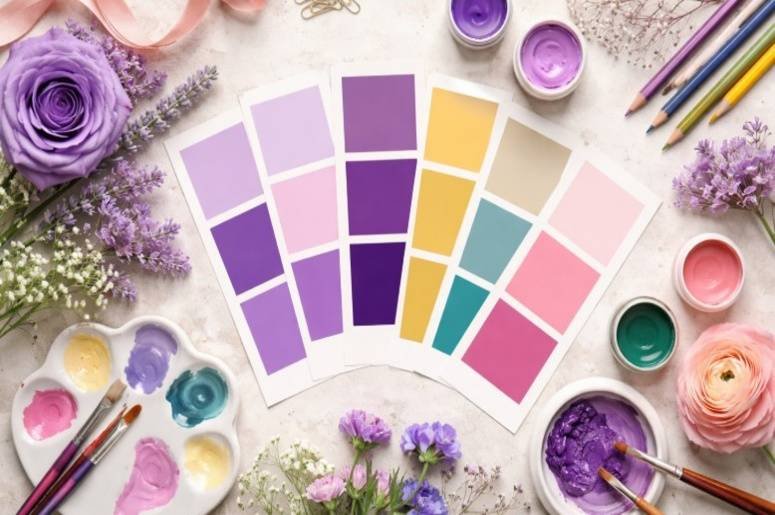
Warm and cozy – Earthy reds, muted orange, ochre, brown, cream
Calm and airy – Soft blues, sage green, gray tones, off-white
Bold and modern- One bright color with dark neutrals and a strong accent
Moody and cinematic – Deep blue, burgundy, olive, charcoal
Choose a Dominant Color
The biggest improvement I made in my art came from selecting one main color first. This color becomes the visual anchor of the entire piece. Supporting colors should exist to strengthen that dominant color rather than compete with it.
For example:
- A blue palette might include blue, tan, gray, cream, and rust
- A green palette might include olive, beige, gold, brown, and blue
- A red palette might include maroon, blush, gray, and soft neutrals
This approach immediately creates balance and hierarchy.
Use a Simple Color Scheme
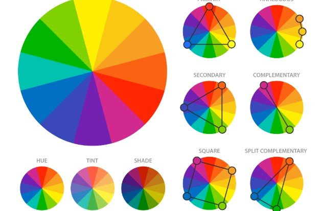
Color schemes give structure to palettes. They prevent random combinations and help colors work together naturally.
Monochromatic
One color used in lighter and darker versions. Best for portraits, minimal work, and moody pieces. This scheme is also commonly used in beginner graphic design exercises because it helps artists focus on value and contrast without worrying about multiple hues.
Analogous
Colors that sit next to each other on the color wheel. Best for landscapes, nature scenes, and soft illustrations.
Complementary
Colors opposite each other on the color wheel, such as blue and orange. Best for strong contrast and dramatic compositions.
Split Complementary
One main color plus two colors near its opposite. Best for balanced contrast that feels energetic but controlled. Using these systems helps artists understand how to choose color palette for art without relying on guesswork.
Limit the Number of Colors
More colors do not always mean better results. In fact, the opposite is often true.
Most successful artworks use:
- three colors for simple studies
- four to five colors for finished work
- six colors only when necessary
A reliable formula is:
- one dominant color
- two supporting colors
- one accent color
- one neutral
Limiting the palette improves harmony and makes decisions easier.
Think About Value Before Saturation
Color alone does not create strong artwork. Value — the lightness or darkness of colors — plays an even bigger role. If all colors share similar brightness, the composition becomes flat.
Helpful value tips:
- include one dark anchor
- include one light area for contrast
- keep the brightest color near the focal point
- check values by squinting at the artwork
Strong value contrast guides the viewer’s eye.
Use Neutrals to Balance Bright Colors

Neutrals help control strong colors and prevent visual overload.
Common neutrals artists rely on include:
- warm gray
- cool gray
- beige
- cream
- brown
- muted navy
- soft olive
Neutrals create breathing space so brighter colors stand out instead of competing.
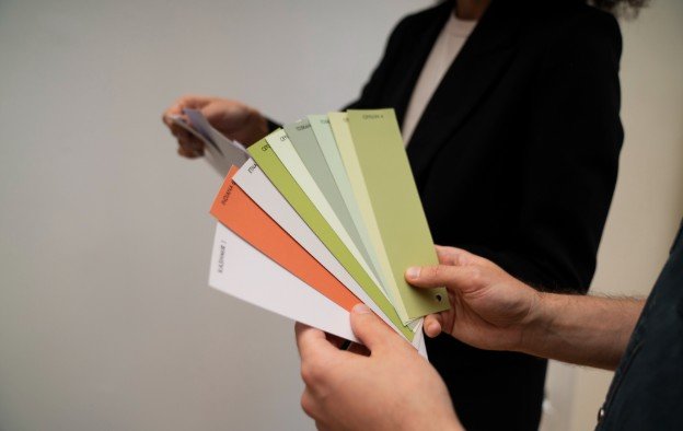
Build Palettes From Reference Images
If I feel stuck, I often pull colors from reference images instead of inventing palettes from nothing.
Good references include:
- landscapes
- fashion photography
- nature scenes
- film stills
- interior design photos
- vintage posters
A simple method works well:
- Choose one reference image
- Identify the dominant color
- Extract three to five supporting tones
- Remove colors that feel repetitive
- Add a neutral if the palette feels too intense
This approach trains your eye quickly.
Test the Palette Before Starting the Final Piece
Testing palettes prevents frustration later.
Simple testing methods include:
- quick swatch strips
- small thumbnail sketches
- digital color blocks
- value studies
Testing allows you to refine colors before investing time in the final artwork.
Avoid Muddy Color Choices
Muddy color often appears when too many pigments are mixed together or when values are too similar.
To avoid this problem:
- mix fewer colors together
- use clean brushes when switching pigments
- keep warm and cool tones separate when possible
- build layers gradually instead of overmixing
- maintain strong value contrast
These habits keep colors vibrant and readable.
Color Palette Ideas for Different Art Styles

Acrylic or oil painting
Use a limited palette so mixing remains clean and predictable.
Digital art
Experiment broadly at first, then lock your palette before rendering details.
Portrait painting
Use controlled neutrals to support skin tones.
Landscapes
Choose colors based on season or lighting mood.
Abstract art
Focus on one color family with contrasting accents.
Common Color Palette Mistakes
- Choosing colors before deciding the mood
- Using too many bright colors
- Ignoring neutrals
- Skipping palette tests
- Giving every color equal importance
Avoiding these mistakes will dramatically improve color harmony.
Frequently Asked Questions
What is the easiest palette for beginners?
Monochromatic palettes are the easiest because they use variations of a single color, which naturally creates harmony and reduces the chance of clashing shades.
How many colors should a palette contain?
Most artwork works best with four or five colors, including one dominant color, a few supporting tones, and a neutral.
Should beginners use bright colors?
Yes, but sparingly. Bright colors work best as accents so they highlight important areas without overwhelming the artwork.
How do artists improve color confidence?
Artists improve by practicing with limited palettes, studying references, and experimenting with value and color combinations regularly.
Final Thoughts
Once I stopped guessing with colors and started using a simple system, my artwork improved dramatically. Choosing a mood, selecting one dominant color, limiting the palette, and combinational testing tools made the process much easier.
Learning how to choose a color palette for art is not about memorizing complicated theories. It is about making a few smart decisions in the right order. With practice, the process becomes intuitive. Colors begin to work together naturally, compositions feel more intentional, and finishing artwork becomes far less stressful.