The first time I tried choosing colors for a design, I picked what “looked nice” to me. The result? A messy combination that felt off even though each color individually seemed fine. That experience made one thing clear: color choices aren’t random. There’s actually a structure behind why some colors work beautifully together while others clash.
That structure is called color theory. Once you understand the basics, choosing colors becomes far easier and more intentional. Instead of guessing, you start building palettes that feel balanced, professional, and visually appealing. For beginners in design, art, digital content, or even interior styling, color theory becomes one of the most practical skills you can learn.
Why Color Theory Matters More Than Beginners Realize

Color theory is the blend of art and science used to understand how colors interact and how they influence human perception. When designers choose colors for websites, product packaging, brand identities, or interfaces, they rarely do it randomly. There’s usually a system guiding those choices.
Understanding color theory helps you:
- Create balanced color palettes
- Improve visual contrast and readability
- Communicate mood and emotion through color
- Avoid combinations that feel chaotic or overwhelming
Once you grasp these basics, you start noticing color decisions everywhere from popular app interfaces to retail packaging and sports branding. The difference between amateur and professional-looking visuals often comes down to how well colors are used together.
Understanding The Color Wheel

The color wheel is the foundation of color theory. It’s a circular diagram that organizes colors based on their relationship with one another. Most traditional color wheels contain 12 colors, divided into three categories.
Primary Colors
Primary colors are the building blocks of all other colors. They cannot be created by mixing other colors together.
- Red
- Yellow
- Blue
Every other color on the wheel ultimately comes from combinations of these three.
Secondary Colors
Secondary colors are created by mixing equal parts of two primary colors.
- Red + Yellow = Orange
- Blue + Yellow = Green
- Blue + Red = Purple
These colors sit between the primary colors on the wheel.
Tertiary Colors
Tertiary colors are created when a primary color mixes with a nearby secondary color.
Examples include:
- Red-Orange
- Yellow-Green
- Blue-Green
- Red-Purple
These fill the remaining spaces on the color wheel and help create more nuanced palettes.
Key Color Properties Every Beginner Should Know

Before building color palettes, it’s important to understand how colors behave visually. Three core properties define how we see and adjust colors.
Hue
Hue is simply the name of the pure color itself.
Examples include blue, red, green, and purple. When people talk about choosing a color, they are usually referring to the hue.
Value
Value describes how light or dark a color appears.
This changes when we add:
- White → Tint (lighter color)
- Black → Shade (darker color)
- Gray → Tone (muted color)
Adjusting value helps create depth, shadows, and highlights in designs or artwork.
Saturation (Intensity)
Saturation refers to how vibrant or dull a color is.
Highly saturated colors feel bold and energetic. Lower saturation makes colors appear softer or more muted. Designers often reduce saturation slightly to create more refined palettes.
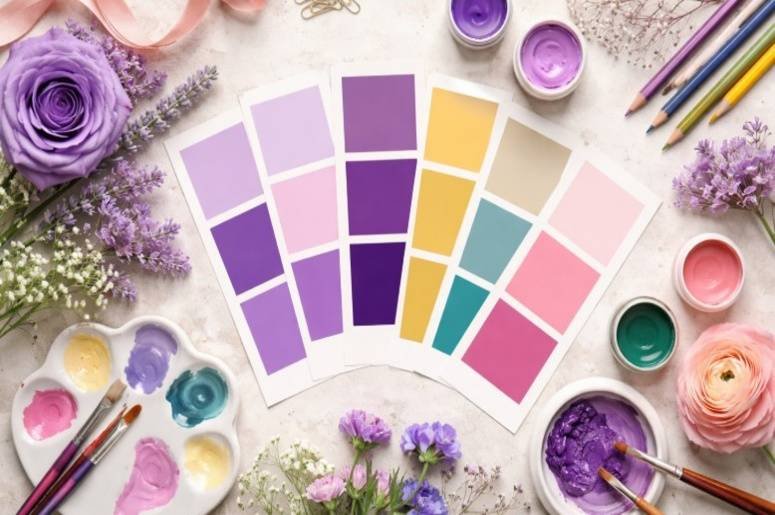
The Basic Color Schemes Beginners Should Know

Color harmony refers to combinations that naturally feel balanced to the human eye. These schemes provide simple frameworks that beginners can rely on.
Monochromatic
A monochromatic palette uses one single color with different tints, tones, and shades.
Example: light blue, medium blue, and navy.
This is one of the easiest palettes to start with because it’s almost impossible to clash.
Analogous
Analogous colors sit next to each other on the color wheel.
Examples:
- Blue
- Blue-Green
- Green
These palettes feel calm and natural because they often appear together in nature.
Complementary
Complementary colors sit directly opposite each other on the color wheel.
Examples include:
- Red and Green
- Blue and Orange
- Yellow and Purple
These combinations create strong contrast and are commonly used in branding and sports team colors.
Triadic
A triadic palette uses three colors evenly spaced on the color wheel.
For example:
- Red
- Yellow
- Blue
This scheme creates vibrant palettes that still feel balanced when used correctly.
Practical Tips To Start Using Colors Correctly

When beginners first learn color theory, they often try too many colors at once. Simplicity usually produces better results. A few practical rules make color choices far easier.
Helpful Color Rules Beginners Can Use
- Follow the 60-30-10 rule – 60% dominant color, 30% secondary color, 10% accent color
- Limit your palette to 2–3 colors when starting
- Use warm colors (red, orange, yellow) for energy and excitement
- Use cool colors (blue, green, purple) for calm or stability
Many well-known brands rely on extremely simple palettes. A strong primary color supported by one or two complementary tones often creates the most memorable visual identity.
Common Color Mistakes Beginners Make

Learning color theory doesn’t mean memorizing every rule. It’s more about developing awareness of how colors behave together.
A common mistake made by graphic design exercises for beginners is using too many colors at once. When a palette includes five or six unrelated hues, the result can feel cluttered. Another frequent issue is ignoring contrast. Light text on a light background or dark colors layered together can make designs difficult to read.
Another overlooked detail is saturation. Using several highly saturated colors together can make a design feel overwhelming. Reducing intensity slightly often creates a more polished look.
With practice, these mistakes become easier to spot. Over time, your eye naturally starts recognizing which combinations feel balanced.
Frequently Asked Questions
1. What Is Color Theory In Simple Terms?
Color theory is a set of principles that explains how colors interact, mix, and create visually pleasing combinations. It helps artists and designers choose colors intentionally instead of randomly.
2. Why Is The Color Wheel Important For Beginners?
The color wheel helps beginners understand how colors relate to each other. It makes it easier to build color schemes like complementary, analogous, or triadic palettes.
3. What Is The Easiest Color Scheme For Beginners?
Monochromatic color schemes are the easiest to start with because they use one color and its variations. This keeps palettes simple while still creating visual depth.
4. How Many Colors Should Beginners Use In A Palette?
Beginners should start with two to three colors. Limiting the palette helps maintain visual balance and prevents designs from looking cluttered.
Final Thoughts
Color theory may seem complex at first, but the basics are surprisingly simple once you understand the color wheel and how colors interact. Learning how hue, value, and saturation work together gives you far more control over your visual choices. Instead of guessing which colors might work, you begin building palettes that feel intentional and balanced.
Like any creative skill, the best way to learn color theory is by experimenting. Start small, observe color combinations around you, and gradually refine your eye for what works.