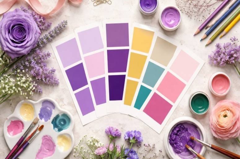
Color mixing used to confuse me when I first started painting and experimenting with art projects. I assumed every color combination had one fixed result. But after working with paints and learning basic color theory, I realized things are more flexible than they seem. If you have ever wondered what happens when these two colors meet, the answer is surprisingly simple.
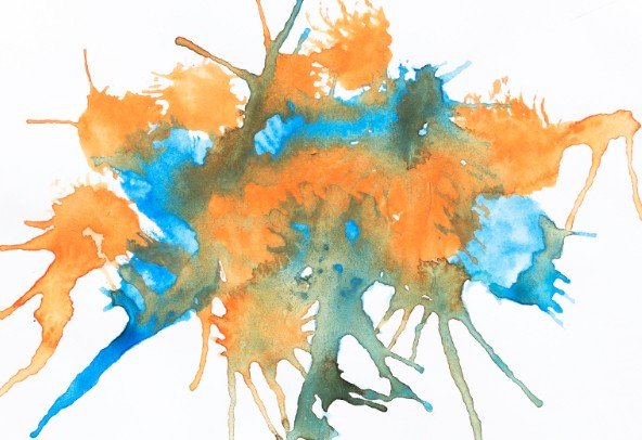
Orange and blue usually create a muted brown or earthy neutral when mixed together. However, the exact result can vary depending on the shade of each color and the proportion used in the mix.
The Quick Answer
Orange and blue make what color? In most paint-mixing situations, they produce a brown or brown-gray shade. This happens because the two colors balance each other out on the color wheel.
When complementary colors combine, they often neutralize each other’s intensity, resulting in a more subdued tone rather than a bright new color. In art classrooms, craft projects, and painting studios, this blend typically creates earthy tones useful for shadows, landscapes, and natural textures.
Why Orange and Blue Often Turn Brown
The color wheel helps explain the result. Orange is made from red and yellow. When blue enters the mix, you essentially combine all three primary colors. When red, yellow, and blue interact in paint, the brightness cancels out and produces a neutral tone, which commonly appears as brown.
That neutralizing effect is why many complementary color combinations shift toward earthy shades instead of bright colors.
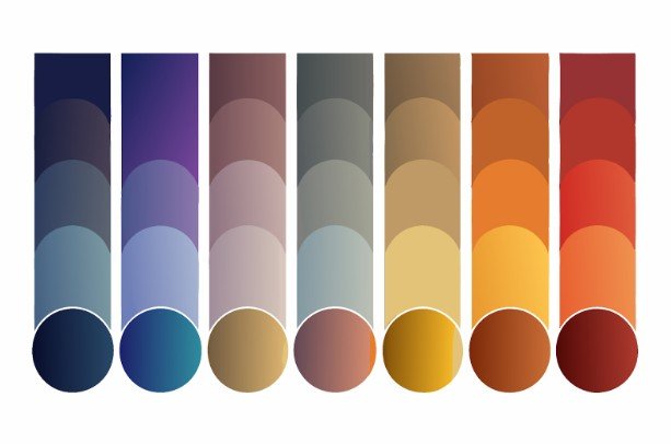
How the Shade of Each Color Changes the Result
Not all blues and oranges behave the same way. The specific pigments used in the mixture can significantly change the final color.
Bright Orange with Dark Blue
When a vivid orange mixes with a deep navy or ultramarine blue, the result often becomes a rich, dark brown.
Light Orange with Light Blue
A softer peach or pastel orange blended with a lighter blue may create a dusty gray-brown or muted neutral tone.
More Orange Than Blue
If orange dominates the mixture, the final color usually appears warmer and slightly reddish.
More Blue Than Orange
Adding extra blue pushes the mixture toward cooler tones, sometimes creating a darker, duller brown.
Why the Mix Can Sometimes Look Muddy
Many beginners feel frustrated when their color mixture turns muddy while trying to make the color black. This usually happens for a few simple reasons. First, the pigments used might already contain darker undertones. If either color includes gray or black pigments, the mix will dull quickly.
Second, blue tends to be a stronger pigment than orange. Even a small amount can overpower the mixture. Third, excessive mixing can reduce vibrancy. Once the color becomes neutral, continuing to blend usually makes it appear flatter.
Paint Mixing vs Digital Color

Physical paint behaves differently from colors on a screen. When artists mix paint, pigments absorb light and combine physically. This process is called subtractive color mixing. Because pigments interact with each other, they often create darker or more neutral results.
Digital colors work differently because screens produce light rather than pigment. That means colors combined in design software may behave differently than real paint mixtures. This difference helps explain why art tutorials sometimes show slightly different results depending on the medium.
When This Color Combination Is Useful
Even though the mixture can look dull if overused, it is extremely helpful in many creative situations.
Creating Natural Shadows
Artists often mix orange and blue color to create realistic shadows for landscapes, portraits, and still-life paintings.
Producing Earth Tones
The blend produces natural colors similar to soil, wood, clay, and stone.
Balancing Warm and Cool Palettes
Orange introduces warmth while blue adds cool contrast. When balanced carefully, the mix produces subtle tones that add depth to artwork.
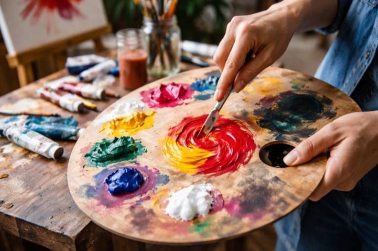
A Simple Method for Mixing These Colors
If you want cleaner results, try a slow mixing approach. Start with orange on your palette. Add a very small amount of blue. Mix gradually and observe the color change. Stop once the tone reaches the shade you want. If the color becomes too dark, you can lighten it slightly by adding white. This controlled method prevents the mixture from becoming overly muddy.
Practical Uses for Beginners
This color combination works well for many beginner projects. It is useful for painting exercises that teach color theory. It can help create design backgrounds online for canvas art. Many craft projects also use the blend to produce rustic or natural-looking tones. Learning how complementary colors behave is one of the most helpful skills for new artists.
Frequently Asked Questions
1. Does orange and blue make brown or gray?
Most of the time the result is brown or a gray-brown neutral. The exact color depends on pigment strength and mixing ratio.
2. Can orange and blue make black?
In rare cases, very dark shades of these colors may produce a nearly black tone, but this is not the most common result.
3. Why do complementary colors look dull when mixed?
Complementary colors sit opposite each other on the color wheel. When mixed, they neutralize each other and reduce brightness.
Final Takeaways
When I first experimented with color mixing, I expected every combination to produce something bright and obvious. Over time, I realized the real beauty of color theory lies in subtlety. Understanding how complementary colors interact helped me control my palette much better.
Once you learn how orange and blue interact, it becomes easier to create natural shadows, earthy tones, and balanced color palettes. Instead of seeing the result as muddy, I now see it as one of the most useful neutral colors an artist can create.