When people first step into design, the biggest confusion isn’t tools. Its structure. Anyone can open a design tool, choose colors, or place shapes on a screen. The challenge is knowing why some designs look balanced and professional while others feel messy or confusing. That difference usually comes down to understanding the core principles behind visual composition.
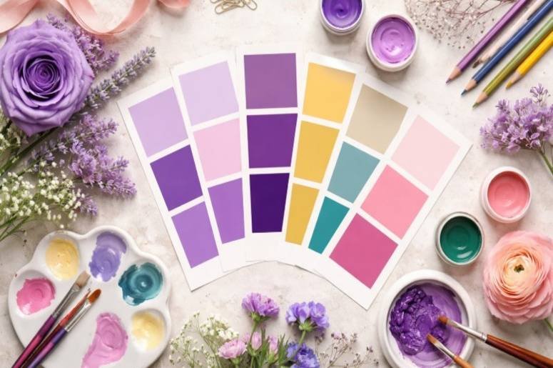
Over time, designers realized that strong visual work follows certain patterns. These patterns help organize elements like color, typography, shapes, and spacing into something that feels natural to the human eye. That’s where the 9 principles of design come in. Think of them as practical rules that help turn random visuals into clear, engaging communication.
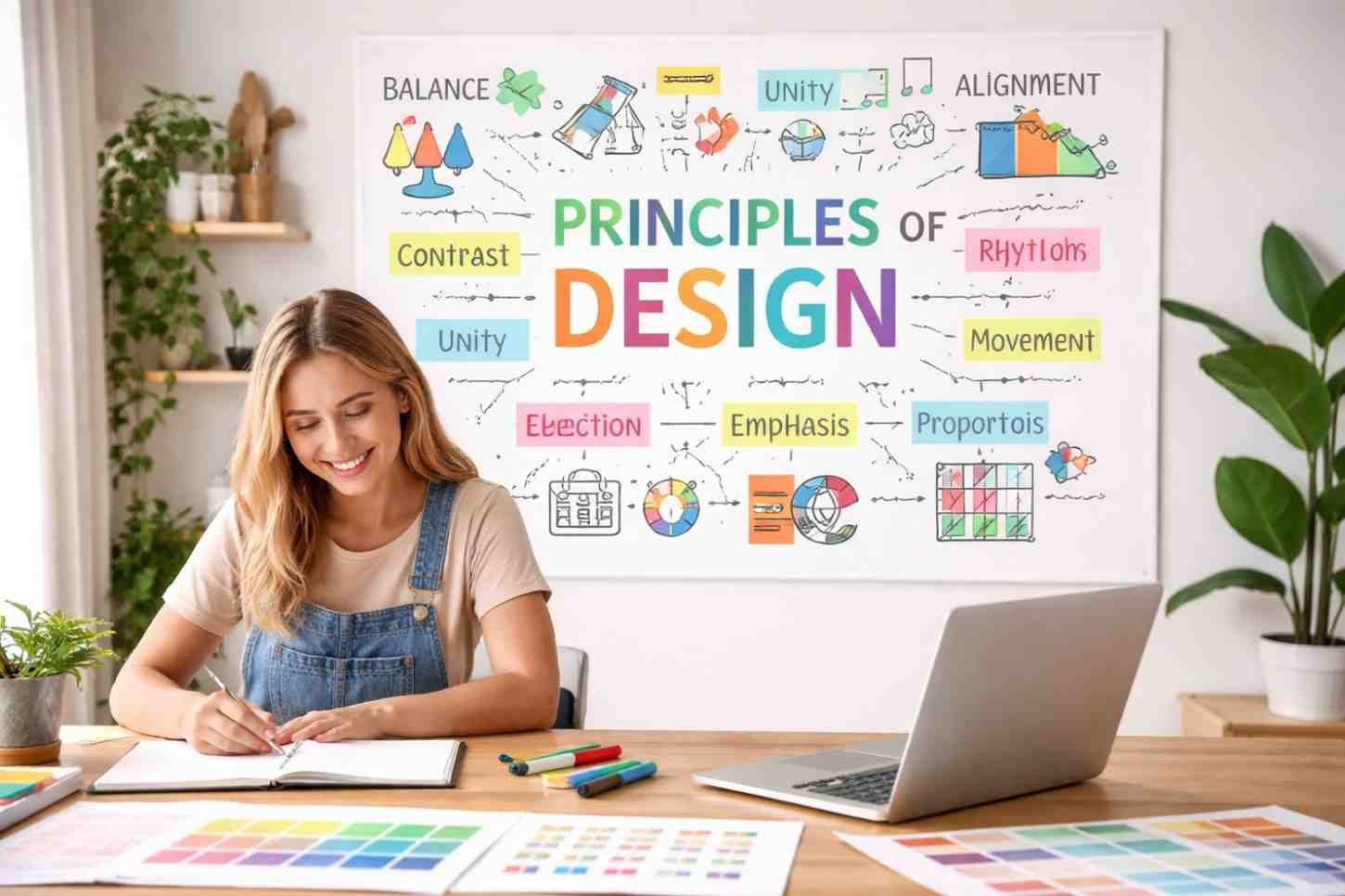
What Are The 9 Principles Of Design?
The 9 principles of design are guidelines used to arrange visual elements so a composition feels organized, readable, and visually appealing. They help designers control how viewers interpret a layout, what they notice first, and how their eyes move through information.
For beginners, these principles become the foundation of graphic design principles, visual design principles, and digital interface layouts. Whether you’re designing a website header, product packaging, presentation slide, or social media graphic, these rules quietly shape how everything works together.
Why Design Principles Matter For Beginners
Many beginners start by experimenting with colors, fonts, and layouts. That’s a good start, but without structure, the results often feel inconsistent.
Design principles solve this problem by giving you a framework.
They help you:
- Organize visual elements logically
- Create a clear visual hierarchy
- Improve readability and user experience
- Maintain consistency across designs
- Guide the viewer’s attention naturally
Once these fundamentals become intuitive, creating effective layouts becomes much easier.
1. Balance
Balance refers to the distribution of visual weight within a composition. Every element, such as images, text, colors, and shapes, has weight depending on its size, brightness, or complexity.
Designers typically use three types of balance:
Symmetrical balance
Elements are evenly distributed across a central axis. This creates stability and formality. Corporate websites and editorial layouts often use this structure.
Asymmetrical balance
Different elements balance each other without being identical. A large image on one side might be balanced by multiple smaller elements on the other.
Radial balance
Elements are arranged around a central point. This structure appears often in logos, icons, and circular visual compositions.
When balance is missing, a design can feel awkward or visually heavy on one side.
2. Contrast
Contrast is what makes elements stand out from each other. Without contrast, everything blends together and the viewer struggles to identify important information.
Designers create contrast through differences in:
- Color (light vs dark)
- Size (large vs small)
- Typography (bold vs thin)
- Shapes or textures
For example, a bright button against a neutral background instantly attracts attention. Contrast also plays a major role in accessibility because strong contrast improves readability.
3. Emphasis

Every graphic design exercise needs a focal point. Emphasis is the principle that determines where the viewer looks first.
In many layouts, the focal point might be:
- A headline
- A product image
- A call-to-action button
- A bold visual element
Designers create emphasis using scale, color, placement, or contrast. Without emphasis, a layout feels flat because nothing stands out as important.
4. Proportion (Scale)
Proportion refers to the size relationship between elements.
Larger elements typically signal greater importance, while smaller elements provide supporting information. Designers use this concept constantly when structuring content.
For instance, a large headline immediately signals the main message. Supporting text appears smaller, and fine details appear even smaller.
Proportion helps create visual hierarchy, which makes content easier to scan and understand.
5. Repetition
Repetition strengthens a design by reusing certain elements consistently. This could include colors, shapes, fonts, icons, or spacing patterns.
When repetition is used well, it creates visual consistency. It also plays a key role in branding because recognizable elements appear across multiple materials.
For example, repeating the same accent color across headings, buttons, and icons helps tie the design together.
Without repetition, layouts often feel disconnected or random.
6. Movement
Movement describes the path the viewer’s eye follows when looking at a design.
Good layouts guide the viewer through information in a logical order. Designers achieve this through:
- directional shapes or lines
- strategic placement of elements
- contrast between sections
- visual hierarchy
A common reading pattern follows an “F-pattern” or “Z-pattern,” especially on digital screens. Designers often structure layouts around these natural viewing habits.
7. White Space (Negative Space)
White space refers to the empty area around elements. Many beginners assume empty space is wasted space, but the opposite is true.
White space helps:
- improve readability
- reduce clutter
- highlight important elements
- create breathing room in layouts
Minimalist design styles rely heavily on white space because it allows key elements to stand out clearly.
8. Unity (Harmony)

Unity ensures that every part of a design feels like it belongs together. When unity is present, the layout appears cohesive instead of scattered.
Designers achieve unity through:
- consistent color palettes
- repeating visual elements
- aligned layouts
- consistent typography
A unified design feels intentional and polished because every element contributes to the overall composition.
9. Variety (Rhythm)
While unity keeps a design cohesive, variety keeps it interesting.
Variety introduces subtle differences in elements so the layout does not feel repetitive or monotonous. Designers may vary shapes, imagery styles, spacing, or color accents.
The key is balance. Too little variety makes designs boring, while too much creates chaos.
When done correctly, variety adds rhythm and energy to visual compositions.
Frequently Asked Questions
1. What Are The 9 Principles Of Design In Simple Terms?
The 9 principles of design are guidelines that help organize visual elements like color, typography, shapes, and spacing into a balanced and visually appealing composition.
2. Are The Principles Of Design The Same As Design Elements?
No. Design elements include things like color, line, shape, texture, and typography. The principles of design explain how those elements should be arranged.
3. Why Should Beginners Learn Design Principles?
Understanding design principles helps beginners create structured, readable, and visually balanced layouts instead of randomly placing elements.
4. Do Professional Designers Still Use These Principles?
Yes. Even experienced designers rely on these fundamentals when building layouts, branding systems, user interfaces, and marketing visuals.
Final Thoughts
Learning the 9 principles of design changes how you look at visual content. Instead of seeing colors and shapes randomly placed on a screen, you start noticing structure, balance between elements, contrast guiding attention, spacing improving clarity, and movement leading the eye across the layout. These principles quietly shape everything from websites and mobile apps to advertisements and product packaging.
The more you practice applying them, the more natural they become. Over time, strong design stops feeling like guesswork and starts feeling like a structured creative process.