A few years ago, I started noticing something interesting while studying successful brands. The companies that felt modern, trustworthy, and memorable all seemed to share one thing: their logos were incredibly simple yet instantly recognizable. They were not overloaded with shadows, gradients, or complicated illustrations. Instead, they felt intentional and clean.
That curiosity pushed me to spend time understanding how to create modern logo designs in a smarter way. I realized that great logos are not just decorative artwork. They are branding tools that communicate personality, trust, and professionalism within seconds.
Once I began studying successful design guides and real-world branding examples, a clear pattern emerged. Modern logos rely on clarity, smart typography, thoughtful color choices, and flexibility across digital platforms. When those elements work together, the result is a logo that looks fresh today and still feels relevant years later.
What makes a logo look modern today?
A modern logo usually feels simple, sharp, and purposeful. Instead of using complex shapes or decorative details, modern designs focus on clarity. Clean lines, strong typography, and balanced spacing are common characteristics.
Another defining trait is intentional minimalism. A modern logo removes unnecessary visual elements so the core message becomes stronger. When every shape, color, and line has a purpose, the design immediately feels more professional.
Many successful brands also use geometric structure and controlled color palettes. This creates visual balance while keeping the logo adaptable across different environments such as websites, mobile apps, packaging, and marketing materials.
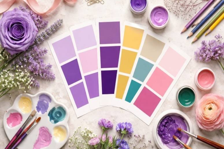
Why should you define the brand before designing the logo?
![]()
One mistake I made early on was jumping directly into sketching without thinking about the brand itself. Over time, I realized the most effective logos start with brand clarity rather than design tools.
A logo should represent the personality of the business. Is the brand playful, professional, bold, elegant, or innovative? These questions shape the direction of the design long before choosing fonts or icons.
Understanding the audience is equally important. A logo for a technology startup will look very different from a logo for a wellness brand or restaurant. Defining the brand identity first makes the entire design process easier because every decision begins to follow a clear direction.
How do you choose the right type of logo?
There are several types of logos, and selecting the right one can dramatically affect how modern the final result feels. Wordmarks, lettermarks, symbols, and combination marks are among the most common formats, and understanding these options can help you improve graphic design skills while making smarter design decisions.
Wordmarks are especially popular for modern brands because they rely entirely on typography. Companies with strong names often choose this style because it builds instant name recognition while keeping the design simple.
Combination logos use both text and an icon. This format works well for businesses that want a recognizable symbol alongside their brand name. Over time, the icon itself may become recognizable enough to stand alone. Choosing the correct structure at the beginning prevents the design from becoming cluttered later.
Which fonts and colors create a modern look?
Typography is often the backbone of a modern logo. Clean and readable fonts usually perform better than decorative ones, which is why typography important in graphic design plays a key role in creating clear and impactful visual identities. Sans-serif typefaces are particularly popular because they feel contemporary and adaptable across digital platforms.
Spacing is just as important as the font itself. Proper letter spacing can transform an ordinary wordmark into a polished logo that feels balanced and intentional. Color choices should also remain controlled.
Modern logos typically rely on a small palette rather than a large combination of colors. One strong primary color supported by a neutral tone often creates a more sophisticated and memorable design. The goal is not to use as many colors as possible but to use color strategically so the logo becomes easier to recognize.
How do you keep a modern logo simple without making it generic?
Simplicity is powerful, but it can easily become boring if handled incorrectly. The challenge is to simplify the design while still giving it a unique personality.
One technique I use is reducing the concept to its most essential elements. If the logo still communicates the brand message after removing extra details, the design is on the right track.
Distinct typography, subtle geometry, or thoughtful spacing can add character without adding clutter. These small adjustments often make the difference between a generic design and a memorable one.
Why does scalability matter in modern logo design?
Logos today must work everywhere. They appear on websites, social media profiles, packaging, advertising materials, and sometimes even mobile app icons.
If a design only works at one size, it quickly becomes impractical. A strong modern logo should remain recognizable whether it appears on a large banner or a small digital avatar.
Testing the logo at different sizes is one of the most valuable steps in the design process. When the logo maintains clarity and readability across multiple formats, it becomes far more useful in real-world branding.
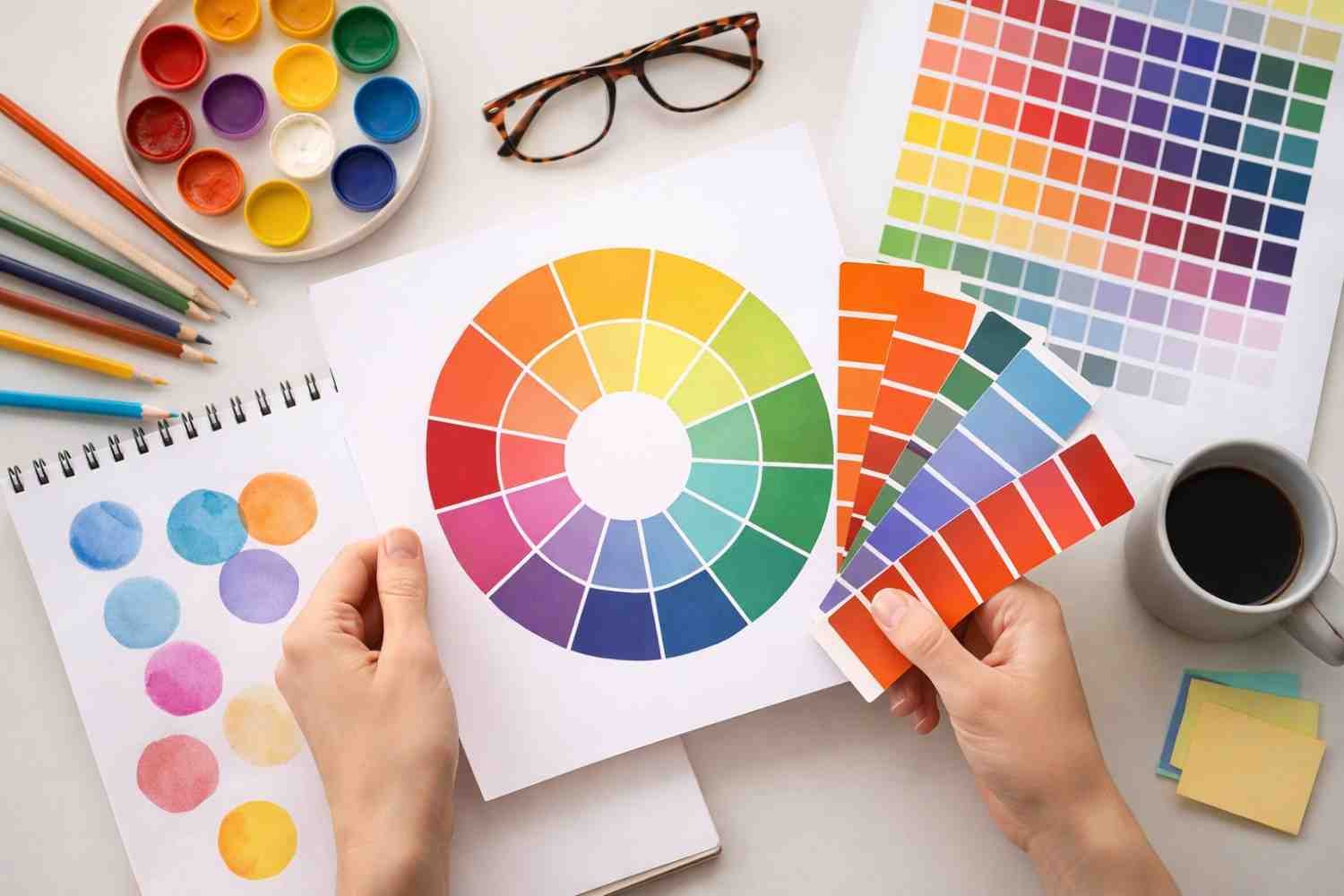
How to create modern logo designs step by step
![]()
When I create a logo from scratch, I follow a structured process that keeps the design focused. First, I define the brand personality and audience. This step establishes the tone of the entire design. Next, I research competitors and gather visual inspiration to understand what already exists in the market.
After that, I choose a logo type that fits the brand. From there, I explore typography ideas and narrow down the color palette. Sketching multiple concepts helps identify the strongest direction before moving into digital design.
Finally, I test the logo across different environments such as website headers, mobile displays, and printed materials. This ensures the design remains clear and functional in real-world use. This step-by-step approach has consistently helped me create stronger designs and avoid unnecessary complexity.
What mistakes make modern logos fail?
One common mistake is chasing trends too aggressively. While trends can provide inspiration, relying on them too heavily may cause the logo to feel outdated very quickly. Another issue is overcomplication. Adding too many shapes, colors, or effects can make a logo difficult to recognize.
Modern branding often succeeds because it focuses on clarity rather than decoration. Designing without considering the audience is another major mistake. A logo should connect with the people the brand wants to reach, not just satisfy the designer’s personal preferences.
Frequently Asked Questions
1. What is the best style for a modern logo?
The best style usually combines simplicity, readability, and strong visual identity. Clean typography, minimal shapes, and balanced spacing often produce the most effective results.
2. Should a modern logo always be minimalist?
Minimalism is common in modern design, but the goal is clarity rather than emptiness. The design should remove unnecessary elements while still expressing the personality of the brand.
3. What type of logo works best for new businesses?
Wordmarks and combination marks are often effective because they highlight the brand name while providing flexibility for marketing and digital use.
4. How many colors should a modern logo include?
Most successful modern logos rely on one to three colors. Limiting the palette improves recognition and makes the logo easier to use across multiple platforms.
Final Thoughts
When I first started studying branding, I assumed logo design was mostly about artistic creativity. Over time, I learned it is actually about clarity, strategy, and restraint. Once I focused on those principles, my designs improved dramatically.
Learning how to create modern logo designs is really about understanding what to remove rather than what to add. The strongest logos communicate a brand clearly without unnecessary complexity.
If I were designing a logo today, I would focus on a clear brand identity, choose a simple structure, limit the color palette, and test the design across multiple formats before finalizing it. That approach consistently produces logos that feel modern, adaptable, and memorable.